Planning your first widget
Duda's Widget Builder allows you to create your own custom widgets and make them available to your customers. You can design beautiful widgets that look and act exactly like other widgets within the Duda platform.
The widget that you build should not only look good and work flawlessly on the live site, but it should also speak the 'Duda language'.
This document aims to provide you with a few UX/UI guidelines so that our customers can intuit the configuration and design of the widget.
Overview
A widget's settings panel consists of two parts: the Content tab and Design tab.
Content tab
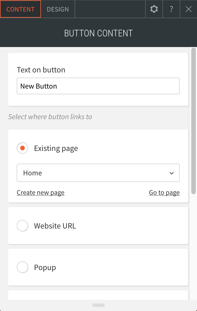
This is where customers will configure the functionality and content of a widget. Values set into the Content tab are commonly rendered in the view or accessed in the underlying source code. For example, you may ask the user for an identifier in order to return the appropriate response. Simply put, the Content tab is the 'brains' behind the widget.

example content tab
Design tab
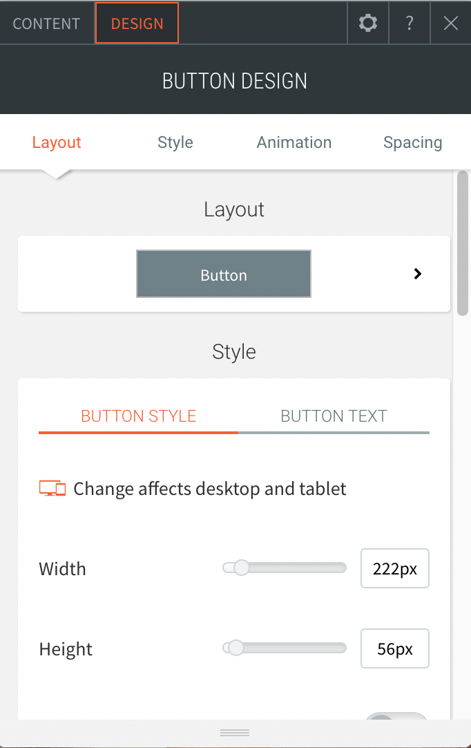
This is where customers can make changes to the look and feel of the widget. For example, if you're displaying a button — you may want to allow the user to adjust some of the following CSS properties: width, background-color, font, and border-radius. Contrary to the Content tab, the Design tab is the 'beauty' in front of the widget.

example single
Guidelines
Planning the widget
The first step would be to create a simple mock of how you want the widget to look and act like on the live site. This will help you break down the various components you’ll need to add to the content and design tabs.
While breaking it down, try and understand whether you are building a single component widget (e.g. a button) or a multi-component widget (e.g. a photo gallery). As you will soon see, this will affect the widget’s settings structure.
Building the Content tab
As we’ve mentioned before, the Content tab is the 'brains' behind the widget.
Single Component Widget

example single component widget
A button widget’s content tab first determines what the button’s displayed text will be and then what happens once you click on it.
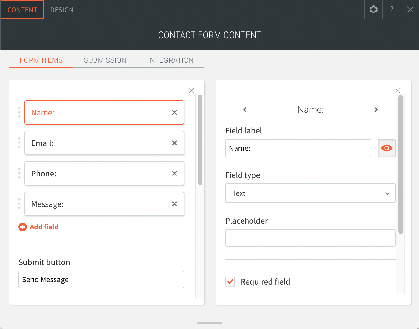
For a multi-element widget, you would want to break this down top-to-bottom.
Multi-Component Widget

example multi-component widget
Building the Design tab
The Design tab determines how the widget will render on a page: layout, color, border, etc.
The structure of the design tab is dependent on the functionality you are aiming to provide, but should generally align with the following guidelines:
- Start with the widget layout and make it the first setting that's presented to the user. Though there are many ways to build a layout selector, the widget builder offers a dedicated layout sub-component. It's recommended that you use this layout sub-component instead of hardcoding CSS rules into the source code.
- Use a dropdown container to group all design-related aspects of a certain element. For example, let’s assume that you have a button that you want users to control it’s dimensions and corners. For that, you would want to use the dimensions and rounded corners components in the widget.
- Arrange elements top to bottom, as they are displayed in the widget’s runtime version. For example, if you have a widget that consists of an image followed by a text, the design of the image will come first, and the design of the text will be second.
General Tips & Tricks
- Use toggles to display conditional inputs instead of a checkbox or dropdown.
- Keep your menus short and use 'side menus' when adding multiple configurations
Updated 11 months ago