Example Card Widget
A step-by-step guide of how to build a custom card widget
Below is an example of a custom widget to follow and learn how to build a widget from beginning to end.
To learn more, check out Building Custom Widgets on Duda University.
Card Widget
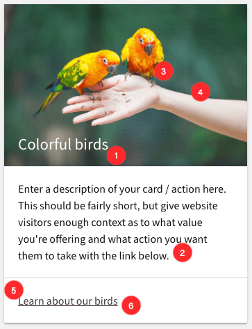
A card is used to display a collection of information or actions. For example, if you have 3 different types of service, you might have 3 cards on your homepage each of which links to a different service pages. Cards are good at breaking up designs into logical sections that are clear to visitors. Here’s an example of a card layout/design.

In the example above, the input types are numbered. These will correspond with the content input types that we will need for the widget itself:
- Title
- Description
- Card Images
- Image Alt Text
- Link Text
- Link Destination
We will start by creating a new widget and calling it Card Widget.
1. Content Options
After creating the widget we will define the content inputs for our widget. You will want to create content inputs in this order with the following settings.
Card Title
- Type: Text
- Variable: cardTitle
- Descriptive Label: Title text of card (on image)
- Default Value: Colorful birds
- Placeholder text: Enter Card Title, keep it short
- Required field: checked
Card Image
- Type: Image
- Variable: cardImg
- Descriptive Label: Card Image
- Default Value: https://dp-cdn.multiscreensite.com/e_gallery/_Birds-Eating-Hand_1348_899_d.jpg
- Required field: checked
Image Alt Text
- Type: Text
- Variable: cardImgAlt
- Descriptive Label: Alt text on image
- Placeholder text: Enter a few words that describe the image above
- Required field: unchecked
Card Description
- Type: Large Text
- Variable: cardDescription
- Descriptive Label: Card Description
- Default Value: Enter a description of your card / action here. This should be fairly short, but give website visitors enough context as to what value you're offering and what action you want them to take with the link below.
- Required field: Unchecked
Card Link Text
- Type: Text
- Variable: cardLinkText
- Descriptive Label: Link text
- Default Value: Learn about our birds
- Placeholder text: Enter action oriented text here
- Required field: Unchecked
Link
- Type: Link
- Variable: cardLink
- Descriptive Label: Link target/destination
- Layout: Embed
- Required field: Checked
Since there are a large number of content options, we can use the divider content input to help organize the content options.
2. Create Design Options
For the last part of the widget, we need to set up the design input options. We'll have five total to allow design control over the widget.
Card Title Style
- Type: Text Style
- Descriptive Label: Card title style
- Selector:
.cardTitle
Card Description Style
- Type: Text Style
- Descriptive Label: Card description style
- Selector:
.cardDescription
Card Link Style
- Type: Text Style
- Descriptive Label: Card link style
- Selector:
.cardLink
Background Style
- Type: Background
- Descriptive Label: Background style
- Selector:
.cardWrapper
Card Size
- Type: Dimensions
- Descriptive Label: Dimensions
- Selector:
.cardWrapper
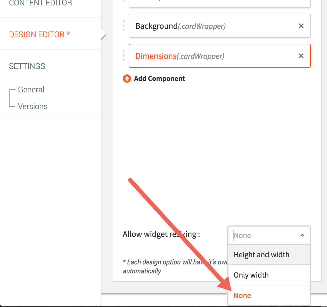
The final step is to turn off the allow widget resizing option. Since we have already given resizing within the widget design, we do not want to allow users to resize using the inline style options.

3. Card Custom Code
Our card widget will use custom HTML and CSS both defined below.
HTML
In the HTML section, place the following HTML.
<div class="cardWrapper shadow">
    <div class="cardImg">
        <img class="cardImg" src="{{cardImg}}" alt="{{cardImgAlt}}"/>
        <h3 class="cardTitle">{{cardTitle}}</h3>
    </div>
    <div class="descriptionWrapper">
        <p class="cardDescription">{{cardDescription}}</p>
    </div>
    <div class="cardLink">
        {{#custom_link cardLink}}
            {{cardLinkText}}
        {{/custom_link}}
    </div>
</div>
You'll notice the same variable names match up from the content and design input options we set in the steps above. This is critical to connecting the widget settings to the actual functionality of the widget.
CSS
Next, we need to write our CSS for the widget. This will give the widget its structure and make sure everything fits in the correct place.
.cardImg {
    position:relative;
}
.cardImg img {
    display:block;
    position:relative;
    top:0;
    left:0;
    bottom:0;
    right:0;
    width:100%;
}
.cardImg .cardTitle {
    position:absolute;
    left:0;
    bottom:0;
    padding:0 0 20px 20px;
    margin:0;
    color:#fff;
}
.cardDescription {
    padding:20px;
    margin:0;
}
.cardLink {
    padding:20px;
    border-top:1px solid #ccc;
    margin:0;
}
.cardWrapper {
    background-color:#fff;
    position:relative;
    margin: 0.5rem 0 1rem 0;
    transition: box-shadow .25s;
    border-radius: 2px;
    height:100%;
}
.shadow {
    box-shadow: 0 2px 2px 0 rgba(0,0,0,0.14), 0 1px 5px 0 rgba(0,0,0,0.12), 0 3px 1px -2px rgba(0,0,0,0.2);
}
/* add this to desktop-tablet.css */
.cardWrapper {
/*Set default width on desktop/tablet*/
width:350px;
}/* add this to mobile.css */
.cardWrapper {
/*Set default width on mobile*/
width:100%;
}Again, you'll notice familiar CSS classes that we assigned originally in the widget design panel.
Preview
If done correctly, you can now preview your widget and publish if you feel it's ready to go live. If you want a challenge, try making the card image linkable to the same target as the link at the bottom.
Updated 11 months ago