Conditional Inputs
Widget Builder allows you to show only certain design inputs based on the options that are selected within a widget. This means you can be smart about what options you offer to a user based on what settings they've selected.
For example, if you have a widget that has several different types of layouts, you might want to offer different styling inputs for each layout. Layout one might have a text style and background style, while layout two might have border and sizing options instead.
Grouping
Duda allows you to set up groups of design or content inputs. These allow you to logically organize different input groups based on specific functionality that they represent, what features they allow you to configure, etc..
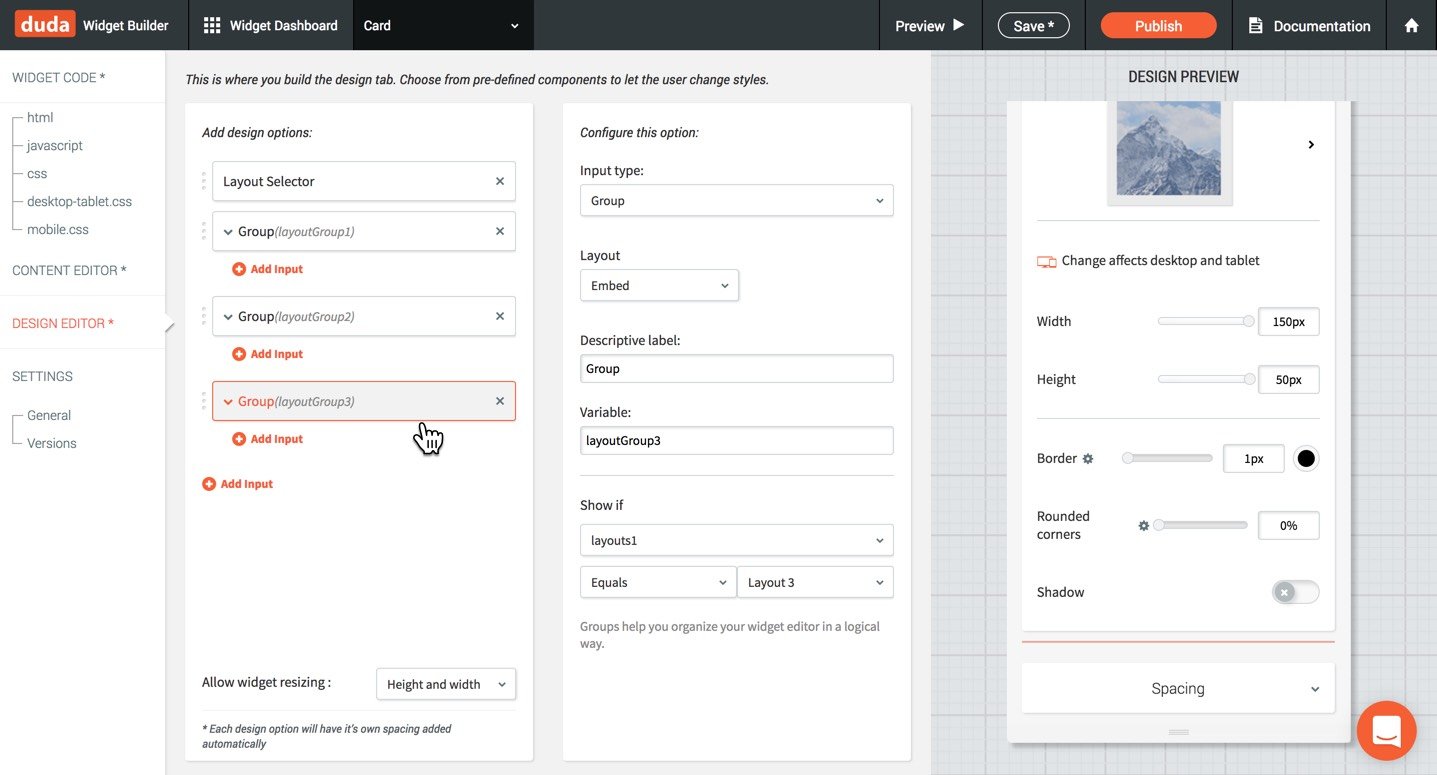
As an example, you might be creating an image slider that has several different layouts: Progress dots, preview images below and arrows to switch images. For each of these layouts, it makes sense to group design inputs for each into their own group. Later, you can use these groupings to show and hide the entire group.
When you create a group, you give it a variable that can be used to conditionally show at certain times.
By grouping inputs together, you can choose what layouts are visible during the first load of the widget options panel. There are four options of how the inputs within the group will be displayed.
- Embed: This is the default, where all inputs within the group will be shown, inline.
- Container: A container will draw a box around the group and show a clear differentiation between inputs below and above this group.
- Side Menu: Will collapse the group and force the user to click on it in order to expand with more options. This is useful for advanced design options that you might want to be harder to find.
- Expandable: Will collapse the group and expand (like an accordion) to show all the input options within the group.
Conditional Displays
Inputs or groups can show or hide based on the logic/selection of other input types. This allows you to have large differences in design & style, while still keeping widget editing simple.
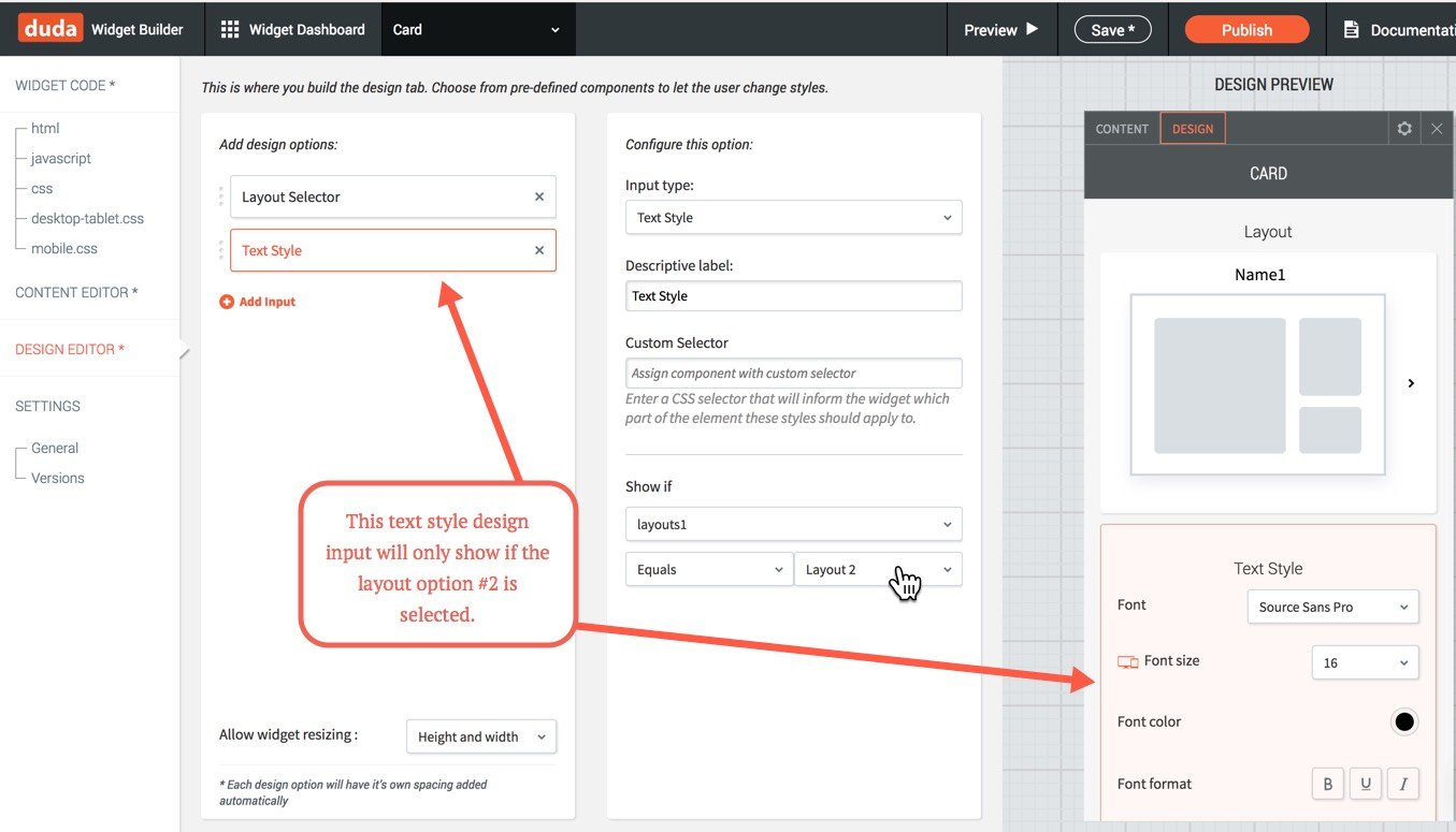
To use conditional displays, you first need to add a logic-based input. These are Layout Selector, Toggle, Checkbox, Radio Buttons, and Dropdown. After you have a logic-based input, you will see the option to show the input (or input group) based on if certain values are true or set to a certain value.
In the example image below, we've added a text style input that will only show if the layout above it has been selected as 'layout 2'.

Below is another example of grouping design inputs into similar groups. This time, based on if the layout type selected is number one, two, three.

Updated about 2 months ago