Content Editor
Input Options
The following table contains a list of common input options that can be set for any input type while building a widget. It also includes the best practices for each option for building user-friendly widgets.
| Name | Description |
|---|---|
| Variable | Variable name of the input when accessed from inside the widget. |
| Descriptive Label | Name that's associated with the input. |
| Default Value | Default value used for the input. |
| Placeholder Text | Descriptive text in the background of the input. |
| Tooltip Text | Text displayed when a user hovers over the tooltip icon. |
| Required | Toggle to ensure a value is entered into the input. |
Checkbox
A checkbox returns a boolean value based on whether or not it's checked. Checkboxes are great for defining conditions of how the widget will work.

Date
Allow the user to select a date from a calendar pop-up. The user can only select a date and not a specific time. The calendar will output a timestamp in standard universal full date/time format.
It is recommended that you only interact with the date format in JavaScript, as outputting the date via handlebars will produce a long digit.

Description
The description input is not actually an input type. It allows you to add text directly into the widget content panel to help users understand what to input and how the widget functions. We recommend keeping it concise and direct.
You can insert standard HTML into the description to include links, bolding, etc.

Divider
Like the description, a divider is not a real input type. It allows you to section off different parts of the widget panel with a horizontal divider.

Dropdown
You can use a dropdown input to define multiple values for a user to select from. The value of the dropdown can be accessed by placing the variable name of the input down. This is great for defining a class name to be used within the HTML.

Group
A group input helps organize the widget panel by grouping related inputs together and creating visual separation for users. A group creates a submenu with a subset of inputs.
There are 4 different layouts for a group. The below example shows the 'side menu' layout.

Icon
Allow the user to choose an icon from Duda's library of SVG icons. This library is maintained by Duda and cannot be extended. Duda will output the SVG HTML directly into the markup.
It is required to use the triple curly bracket in the widget source because the output should be unescaped.

Image
The image input asks users to choose an image from Duda's image gallery. Duda will return an absolute URL to the image. This URL should not be altered in any way, as Duda often dynamically replaces this image source with device-specific images for optimization purposes.
Duda also recommends providing a default image in the event one is not provided by the user. Doing this removes the potential of a poor user experience if an image is not provided.

Large Text
Large text should be used to accept bigger blocks of text, such as descriptions and paragraphs.
There is an option for large text to enable a 'rich text editing' capability. This gives the user an easy way to define text styles such as bold, italics, lists, and more.

Escape rich textIf you use 'rich text editing', you must prevent handlebars from escaping the content as this input produces raw formatted HTML and should be output as such. Preventing handlebars from escaping the content can be done with the triple handlebars mustache
{{{largeText}}}. Learn more here.
Link
The link input will display a list of link options available on the website. This allows users to link to other pages of the website, external websites, popups, and more.
To output a link, the handlebar custom_link must be used. This will ensure that Duda handles the anchor correctly.

Links from connected dataIf a URL is supplied via connected data, you are not able to use the
custom_linkhelper. In this circumstance, the HTML should output the URL directly into thehrefattribute of an anchor tag. e.g.,<a href="{{linkVariableName}}>Click Here</a>
List
You can allow users to define multiple types of inputs. For example, if you want to have a list of events, or questions in an FAQ, etc. The list input allows users to enter as many items as they might need. A list is stored as an array and can have as many inputs as needed.

Accessing list entriesThe previous example allows the user to enter as many products and services as they'd like. Each product and service has a name and description. These properties of a list item can be accessed using the each helper. This will loop through each item of the list and give you access to each inner list item.
Radio Buttons
The radio button input type allows you to provide users with a list of options and limit the number of selections to one option.

Slider
The slider input type shows the user a slider that can be used for selecting a number on a scale.
This is helpful for when you need a user to select a number. Rather than requiring them to input something into text, you can use a slider. For example, you might want to use this with an image slider that changes images every x seconds or a hover effect that takes place after a few seconds.

Text
The text input is the most basic input type. It allows you to collect free text from users.
The Text input type supports regular expression validation. Learn more about that here.

Toggle
Similar to a checkbox, a toggle returns a boolean based on whether or not it's toggled. The toggle is generally a better choice than the checkbox unless there are multiple true/false statements from the user that need to be selected at once.

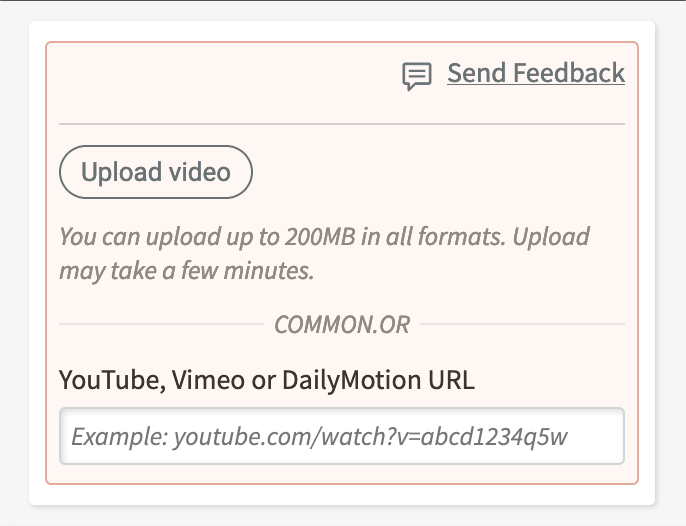
Video
The video input type allows your users to upload video directly to the Duda CDN, or provide a URL to a Youtube, Vimeo or Dailymotion page.
The input provides an object with the following properties for use within a widget's HTML or JS:
| Property | Description |
|---|---|
| type | Value describing the source of the video: youtube, vimeo, dailymotion or cdn. |
| poster | URL pointing to a poster frame (image) for the video. |
| videoUrl | URL to the video or hosted video web page. For Youtube, Vimeo or Dailymotion videos, this will be the site URL the user entered, not the URL to use directly in the embed code. |
Hosted video embedsIf a user entered a hosted video link (Youtube, Vimeo, or Dailymotion) instead of directly uploading the video, you must convert the value to the embed URL. See the JavaScript example below, for an example on how to handle all video types.
function buildFrame (src) {
    var iframe = document.createElement('iframe');
    iframe.frameBorder = 0;
    iframe.allowFullScreen = true;
    iframe.src = src
    return iframe;
}

function hostedVideo (url, type) {
    var domain = sources[type];
    if (!domain) return console.error('Unknown video source.');

    var id = url.pathname.split('/').pop();
    var src = domain + id;
    var iframe = buildFrame(src);
    container.appendChild(iframe);
}

function cdnVideo (url) {
    var video = document.createElement('video');
    video.src = url;
    video.controls = true;
    container.appendChild(video);
}

var sources = {
    youtube: 'https://youtube.com/embed/',
    vimeo: 'https://player.vimeo.com/video/',
    dailymotion: 'https://www.dailymotion.com/embed/video/'
};

var container = element.querySelector('.wb-innerVideo');
var type = data.config.video.type;
var url = new URL(data.config.video.videoUrl);

if (type === 'cdn')
    return cdnVideo(url);

hostedVideo(url, type);
<!-- responsive video container, see CSS and JavaScript tabs -->
<div class="wb-innerVideo"></div>.wb-innerVideo {
width: 100%;
height: 100%;
position: relative;
padding-top: 30px;
padding-bottom: 56.25%;
overflow: hidden;
}
.wb-innerVideo iframe,
.wb-innerVideo video {
position: absolute;
left: 0;
top: 0;
width: 100%;
height: 100%;
}Connected Data
To use custom widgets with Connected Data, make sure the "Enable binding to Connected Data" toggle is on for the input type that you're adding. This toggle is only available for input types that support Connected Data.

Other
Regular Expressions
The text input type allows for regular expression validation. For example, if you only want to accept digits in a text input, then you can set the regular expression validation string to ^\d+$. This is using standard regular expression string validation in JavaScript.
Updated about 1 year ago